
The Real Rate on the 99-Year Clock: A Plain-English Guide


The First True Test of the Colossus Doctrine
A plain-English guide to why interest rates, oil, and the Fed's next move all point the same way. The 1921 to 1930 / 2020 to 2029 Market Analog Series. Clock convention: May 1921 = May 2020, 1927 = 2026.
The short version
There is one number that tells you what your savings are really earning after inflation eats its share. Economists call it the real interest rate. We have been tracking it for the 1920s and the 2020s side by side, ninety-nine years apart, because almost everything else about the two decades has been moving in step. For five years the real rate was the exception. It started at opposite extremes in 1921 and 2020, then met in the middle by 2025. This year it split apart again, because a war in the Middle East pushed oil above $100 and inflation back up. The rest of the economy did not flinch. We read that as the market saying the oil shock is temporary. If the pattern holds, the gap closes the way it did in 1927: prices fall, the long bond stays put, and the real rate climbs back to 4 to 5%. This paper explains what the Fed and the Treasury are about to do to get there, why a single rate increase next week is the key that unlocks it, and why a higher real rate in this particular kind of economy is good news, not bad.
What a "real" interest rate is, and why it matters
Suppose a savings bond pays 5% and prices are rising 3% a year. You are not really 5% richer at the end of the year. You can buy only about 2% more than you could before. That 2% is the real interest rate. It is the yield on a bond minus the inflation rate. It is the number that decides whether savers are getting ahead or falling behind, whether borrowing is cheap or dear in terms of things rather than dollars, and whether money is flowing toward productive investment or away from it.
We measure it the same way in both decades: the yield on the government's long bond minus the change in consumer prices over the previous twelve months. For the 1920s the bond is a long-term U.S. government bond series and the prices are the Bureau of Labor Statistics consumer price index, both from the St. Louis Fed's FRED database. For the 2020s the bond is the 10-year Treasury and the prices are the same CPI. Using the same recipe in both decades means the two lines can be laid on top of each other honestly.
The 99-year clock in one sentence
Our working model is that the 2020s are replaying the 1920s with a 99-year lag: May 1921 lines up with May 2020, 1927 lines up with 2026, and the peak of the cycle comes in 2028. Stock prices, productivity, the job market and the money supply have all followed that script closely enough to take it seriously. This paper is about the one series that broke from it this year.
Opposite starts, same destination
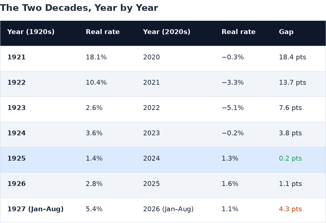
In 1921 America was in a brutal price collapse. Consumer prices were falling 13% a year, so even a bond paying 5% delivered a real return near 18%, and for one month in mid-1921 above 21%. Savers were being paid handsomely. Borrowers were being crushed. In 2020 the picture was the mirror image. The Fed had cut rates to zero and inflation was about to take off, so by March 2022 a 10-year bond paying about 2% against inflation above 8% was losing its owner more than 6% a year in real terms. One decade began with the highest real rate in living memory. The other began with the lowest.
Then the two lines converged. By 1925 the real rate had fallen to about 1.4%. By 2024 it had risen to about 1.3%. In 1926 it was 2.8%, and in 2025, 1.6%. Two decades that had started as far apart as it is possible to start were within about one percentage point of each other. That is the convergence the clock predicted, and it happened on schedule.
What happened in 2026, and why it is not a broken clock
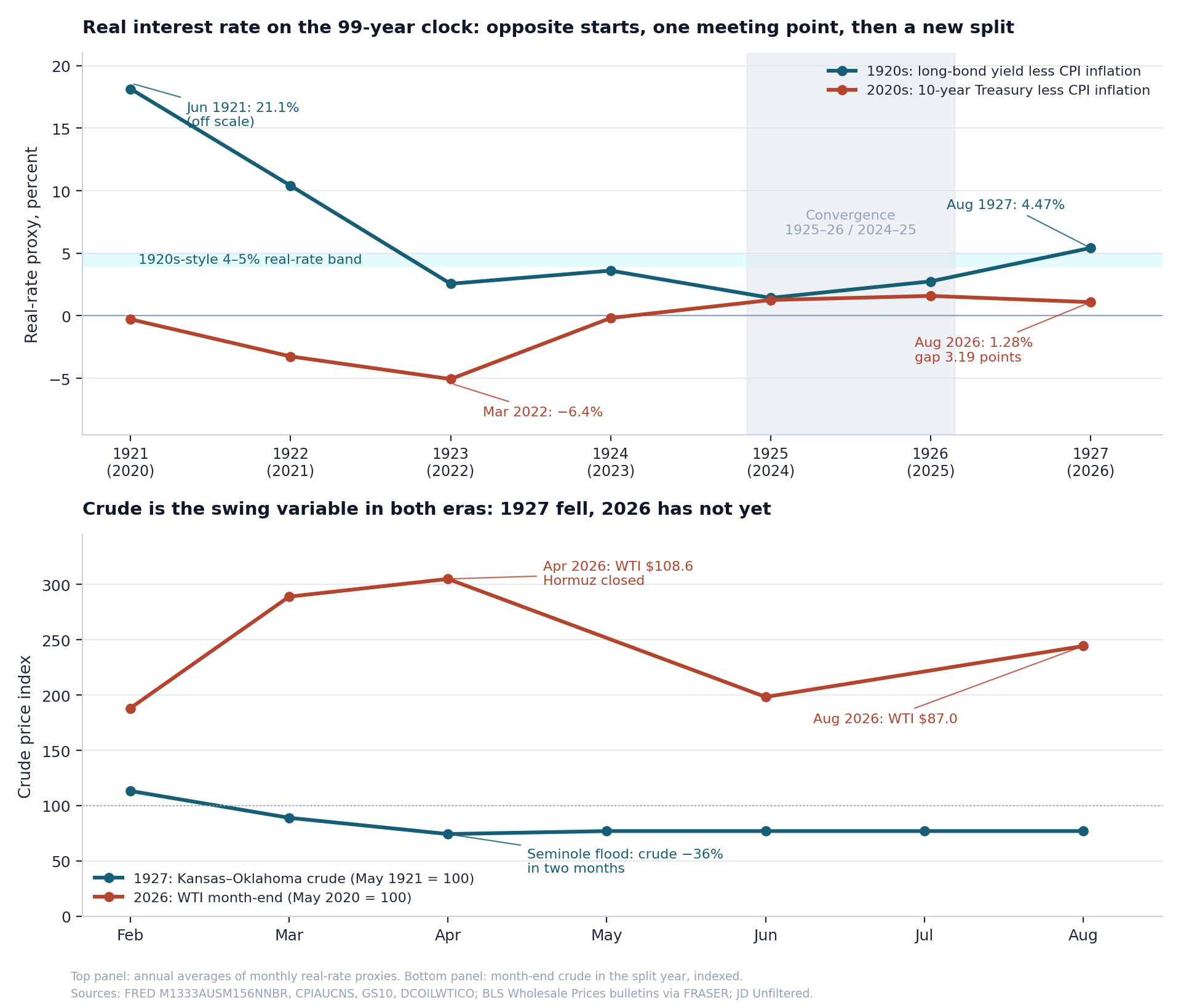
In 1927 the real rate jumped from under 3% to over 5%. In 2026 it fell from under 2% toward zero. Same year on the clock, opposite directions. If you stopped there you would conclude the model had failed. But look at what moved. In 1927 the bond hardly changed. What changed was that consumer prices started falling, and they fell mainly because oil collapsed. A giant new oil field opened in Oklahoma, crude dropped by more than a third in two months, and cheaper fuel pulled the whole price index down. Falling prices pushed the real rate up.
In 2026 the bond again barely moved through the first half of the year. What changed was that prices went up, and they went up mainly because oil spiked. A war with Iran closed most of the Strait of Hormuz, oil went from $67 in February to $109 in April, and it is back above $100 now. Gasoline and diesel dragged the price index up, inflation reached 3.4% in August, and the real rate sank. It is the same machine as 1927, with oil pointing the other way. Strip out the oil, and the two decades are still where the clock says they should be.
Why we think the market is calling the oil shock temporary
Here is the tell. Everything else on the clock is on track. Stocks, productivity, the job market, investment in new equipment: none of them has behaved as if a lasting inflation problem had arrived. Even the bond market has been calmer than the headlines. The 10-year yield spent most of the year between 4.1% and 4.7% while inflation rose from 2.4% to over 4% in May. If investors believed the oil-driven inflation was here to stay, they would have demanded much higher yields to compensate. They did not. The Treasury Secretary himself has called the oil move a supply shock the Fed should look past. Shipping analysts expect the Strait to reopen gradually in the fourth quarter and normal flows to return by early 2027. The economy is treating this as weather, not climate.
Two ways to close the gap
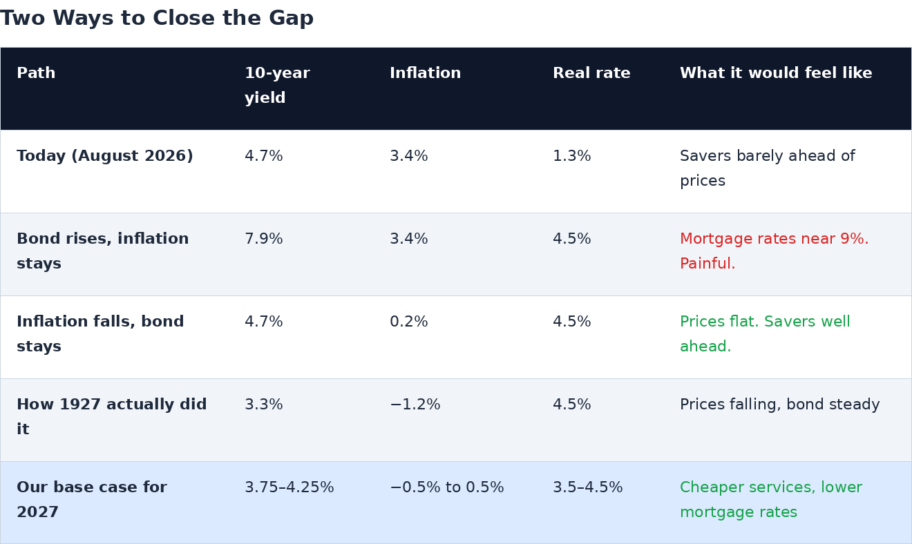
The real rate is a simple subtraction, so there are only two ways for it to rise from today's 1.3% toward the 1927 level of about 4.5%. Either the bond yield goes up, or inflation comes down, or some of each. The arithmetic is stark. If inflation stayed at 3.4%, the 10-year yield would have to rise to nearly 8% to get there, a level not seen since 1990 and one that would do real damage to housing, corporate borrowing and the government's own interest bill. Nobody wants that path. The other path is the one 1927 took: inflation falls to around zero or slightly below, the bond stays roughly where it is or drifts lower, and the real rate rises because the price level fell, not because borrowing got more expensive.
The plan: one rate increase, then a bigger Treasury move
This is where the Federal Reserve and the Treasury come in, and where a piece of jargon needs translating. The Fed controls very short-term interest rates, the rate banks charge each other overnight. The Treasury decides what kind of debt the government issues: short-term bills that mature in weeks or months, or long-term bonds that run 10, 20 or 30 years. Most of the time those two jobs are kept far apart. We think the two are now working the same problem from opposite ends, and we call the arrangement the Bessent/Warsh Accord, after Treasury Secretary Scott Bessent and Fed Chairman Kevin Warsh, who took office on May 22.
Step one: the Fed raises rates once, on September 16
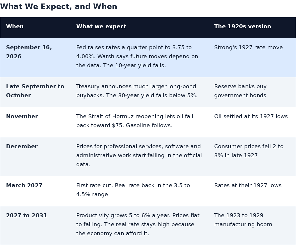
Markets already expect it. After the August inflation report, futures put the odds of a quarter-point increase at about 90%. Warsh laid the groundwork at Jackson Hole in August when he said the Fed's predominant focus right now should be on prices. We expect him to describe the move as depending on the data rather than announcing that he is finished. But we believe it will be the only increase, for three reasons that ordinary readers can check for themselves as the autumn unfolds.
One. It cools a hot economy just enough. The economy is running strong, with business investment in equipment and software up about 9% in a year. A small rate rise leans against that without stopping it.
Two. It pulls money into the dollar. New federal law requires dollar stablecoins, the digital tokens now holding more than $300 billion, to keep their reserves in short-term Treasury bills. A higher short-term rate makes those tokens pay more, which draws global savings into them, which means more buyers for the government's bills.
Three. It tells everyone the Fed will not let oil inflation spread. Once workers and businesses believe that, they stop building the oil shock into wages and prices, and inflation expectations settle down. One credible move does that job. A series of moves is not needed.
Step two: the Treasury buys back long bonds, in much bigger size
The Treasury has been quietly buying back its own long-term bonds to push their yields down. In August it doubled the normal size of those operations. On September 10 it went further, buying $5.2 billion of 10 to 20 year bonds in a single day, triple the usual amount. The bond market barely reacted, and long yields actually rose that day. We do not read that as failure. We read it as the market waiting for the Fed to move first. Once the Fed has raised short rates, we expect Bessent to scale the buybacks up by a large multiple within weeks, concentrated in the 20 and 30 year bonds where yields have climbed the most. The money to do it comes from the flood of buyers for short-term bills that the Fed's move creates. The Fed supplies the demand. The Treasury uses it to retire long debt. That is the Accord.
The shot of whisky, turned upside down
In 1927 the New York Fed's Benjamin Strong cut rates half a point and called it a little shot of whisky for the stock market. The 2026 version works in reverse. Raising the short rate once, credibly, convinces the bond market that inflation will not run away, and that lets the 10-year yield fall. Add the Treasury buying long bonds at the same time, and the fall is larger. Households and companies borrow at rates tied to the 10-year, not the overnight rate. Mortgages, car loans and corporate bonds all key off the long end. So a small rise in the rate almost nobody borrows at produces a meaningful drop in the rate almost everybody borrows at. That is why we think the stock market will welcome the increase rather than fear it.
Why prices should fall: the productivity engine
The single rate increase buys time. What actually closes the gap is falling prices, and the reason we expect them is productivity. In the 1920s, electricity transformed the factory. Output per worker in manufacturing rose about 5.6% a year from 1919 to 1929 while factory employment did not grow at all. The result was cheaper goods, and the price index fell through 1926 and 1927 even as the economy boomed.
Today the equivalent transformation is happening in services, which employ 72% of Americans. Artificial intelligence is doing to accounting, law, software, customer service and administration what the electric motor did to the assembly line: the same work, done by fewer people, at a fraction of the cost. Warsh called AI potentially a new factor of production and noted that spending on AI computing has grown more than 500% in a year. Our companion report on the labor market lays out why we expect economy-wide productivity growth of 5 to 6% a year from 2027 through 2031, against a recent average of about 2%. The early signs are already in the official statistics: output is rising, hours worked are flat, and the cost of labor per unit of output is rising only about 1%. We expect the prices of services to start showing outright declines in the government's data by the December report.
Why a higher real rate is good news this time
Most people hear "higher real interest rates" and think of the early 1980s, when the Fed pushed rates to 13% or more to strangle inflation and threw the economy into the deepest recession since the Depression. That is one way a real rate gets high. It is not the only way, and it is not the way we expect.
Think about what an interest rate is for. It is the price that balances people who want to save against people who want to invest. When a powerful new technology arrives, businesses suddenly see much higher returns from investing in it, so they want to borrow more, and the rate that balances the market rises. Meanwhile the new technology makes goods and services cheaper, so prices fall. A steady bond yield sitting on top of falling prices is a rising real rate. In that world, a high real rate does not mean money is tight. It means the economy has found things worth doing that pay well.
History bears this out. The three episodes below all had real rates above 3.5%. Two of them were booms. The difference is where the real rate came from.
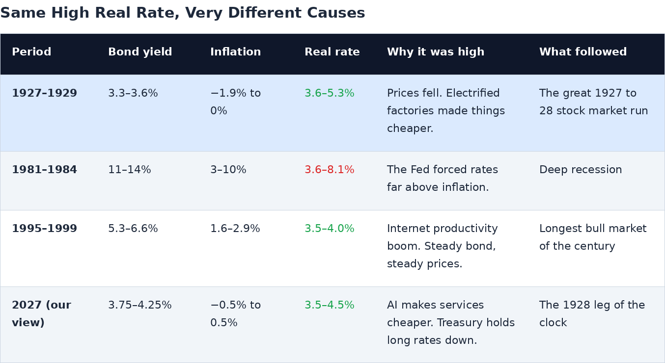
The early-1980s real rate came from a 13% bond forced above 6 to 10% inflation, and it hurt. The late-1990s real rate came from a 6% bond over 2% inflation during the last technology boom, and it coincided with the best decade the stock market ever had. The 1927 real rate came from a 3.3% bond over falling prices, and it coincided with the strongest leg of the 1920s bull market. Today's 1.3% real rate is the odd one out. In an economy about to grow productivity at 5 to 6% a year, a real rate in the 3 to 5% range is simply the market catching up to how much the new capital earns. It arrives through lower prices and a lower, not higher, 10-year yield. It rewards savers without punishing borrowers. And it is the setting in which the biggest single-year gain of the 1920s analog, 1928, took place. For investors, a real rate climbing back into that range is not the warning sign. It is the confirmation.
How to tell if we are wrong
A good forecast tells you in advance what would disprove it. Here is our list. Any reader can check these against the news over the next few months.
The Fed raises rates again in December. A second increase means Warsh is running a 1981-style campaign, not a one-time signal, and the whole story changes.
The 10-year yield does not fall after September 16. If long rates rise on the announcement, the market is reading the hike as the start of a cycle, and the shot of whisky has failed.
The Treasury does not follow through. If Bessent has not announced substantially larger buybacks within about a month of the Fed's move, the two halves of the Accord are not working together.
Oil is still above $90 at the end of November. The clock needs 2026 to be the year oil fell, as 1927 was. A Strait of Hormuz still closed into 2027 would break the timetable.
Service prices keep rising in the December inflation report. Our whole disinflation story depends on AI showing up as lower prices for services. If it does not appear in the data, we are early at best.
A caution on the numbers themselves. The 1920s bond series is not an exact match for today's 10-year Treasury, and 1920s price data were published to one decimal place. The two lines are close enough to compare, but do not read too much into differences smaller than about half a point.
Where the numbers come from
Every figure in this paper comes from public sources that anyone can check, mainly the Federal Reserve Bank of St. Louis FRED database: the 1920s long government bond, the consumer price index, the 10-year Treasury yield, crude oil prices, and 1920s Kansas-Oklahoma crude prices. Policy facts come from the Federal Reserve, the U.S. Treasury, the Bureau of Labor Statistics, and reporting by Reuters and CNBC. The full technical edition of this report, with monthly tables and the complete data appendix, is published alongside it by JD Unfiltered, together with the companion reports The Scissors Labor Market, The Colossus Doctrine and The Morrow Moment.
JD Unfiltered publishes independent macro research. This report expresses the authors' views as of September 12, 2026, is not investment advice, and may be circulated freely with attribution.
The authors hold positions in securities mentioned and reserve the right to buy or sell shares at any time without notice.